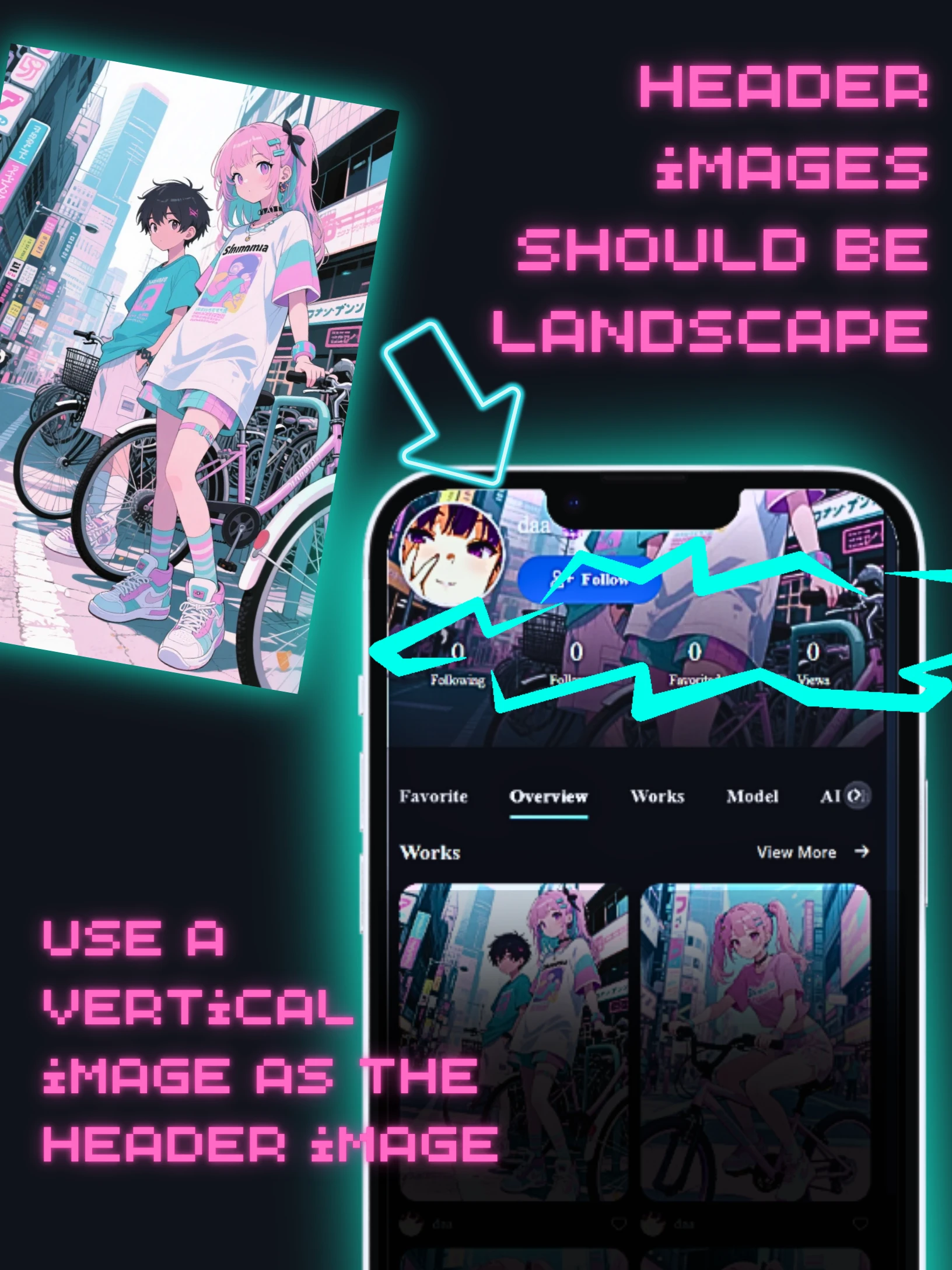
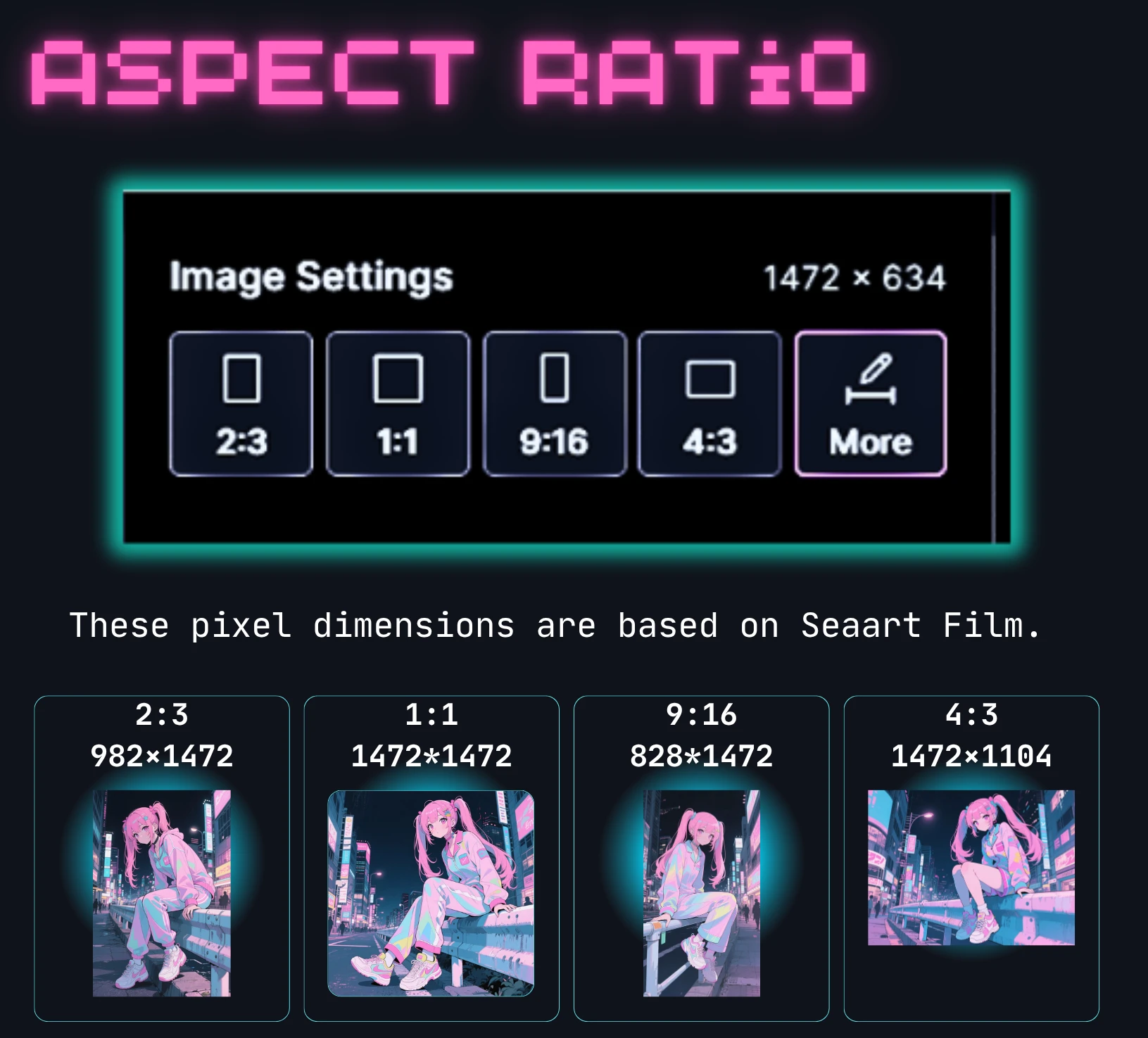
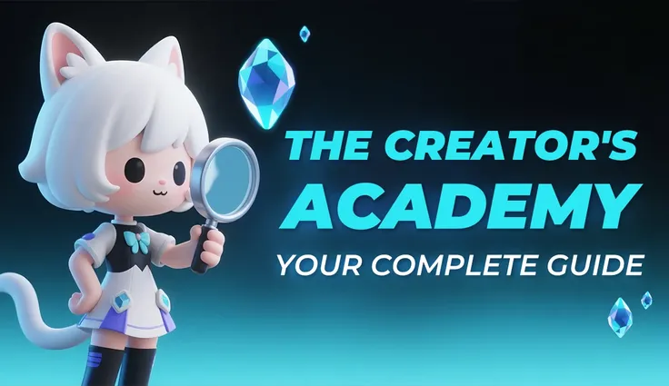
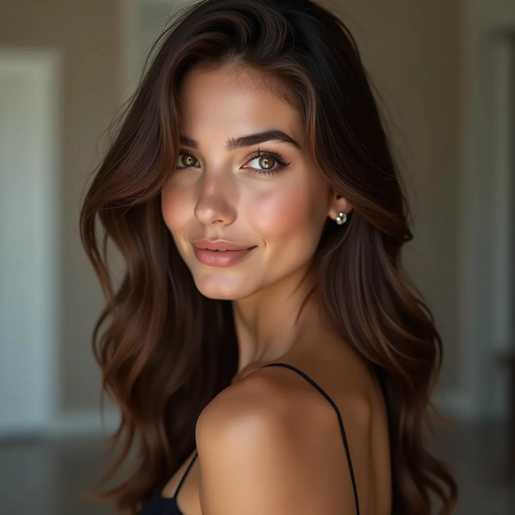
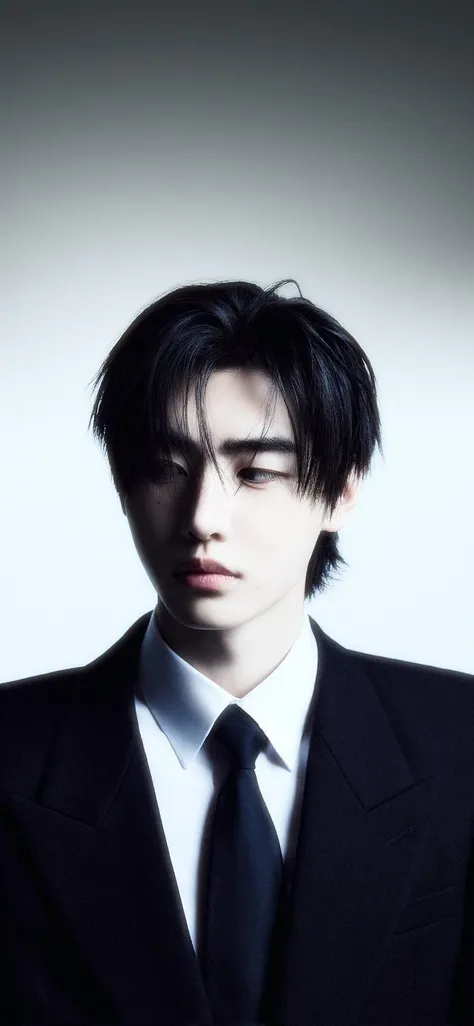
I tried making a header image with a 2:3 aspect ratio.
I tried making a header image with a 2:3 aspect ratio.
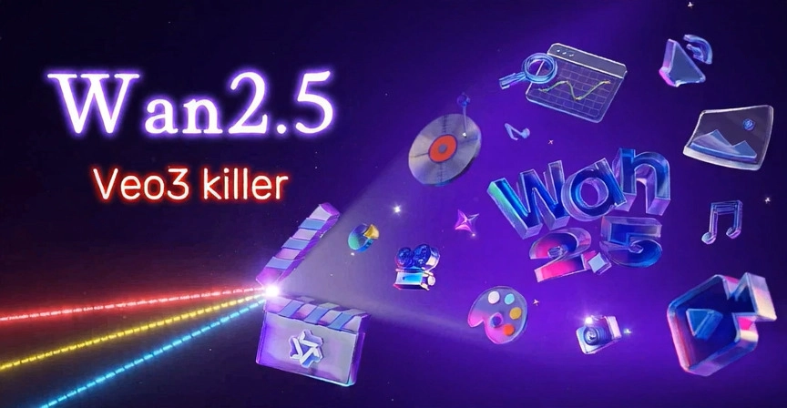
Things to note when inserting a header image This page uses an actual example to explain what happens when you use 2:3. Please refer to another page for the optimal aspect ratio. Here is my example. I created a "2:3" image using SeaartFilm.
Click the link below to read information comparing all aspect rates of SeaArtFilm.
SeaArtFilm Generated Images: Aspect Ratio & Device Breakpoint Display Comparison
Mobile

After that, I uploaded it with the intention of inserting an image in the page header. It's easy to insert a header. For details, click here → And it will be displayed like this. The problem is that the display is different on PC and mobile. This is because it is covered by CSS.
Desktop
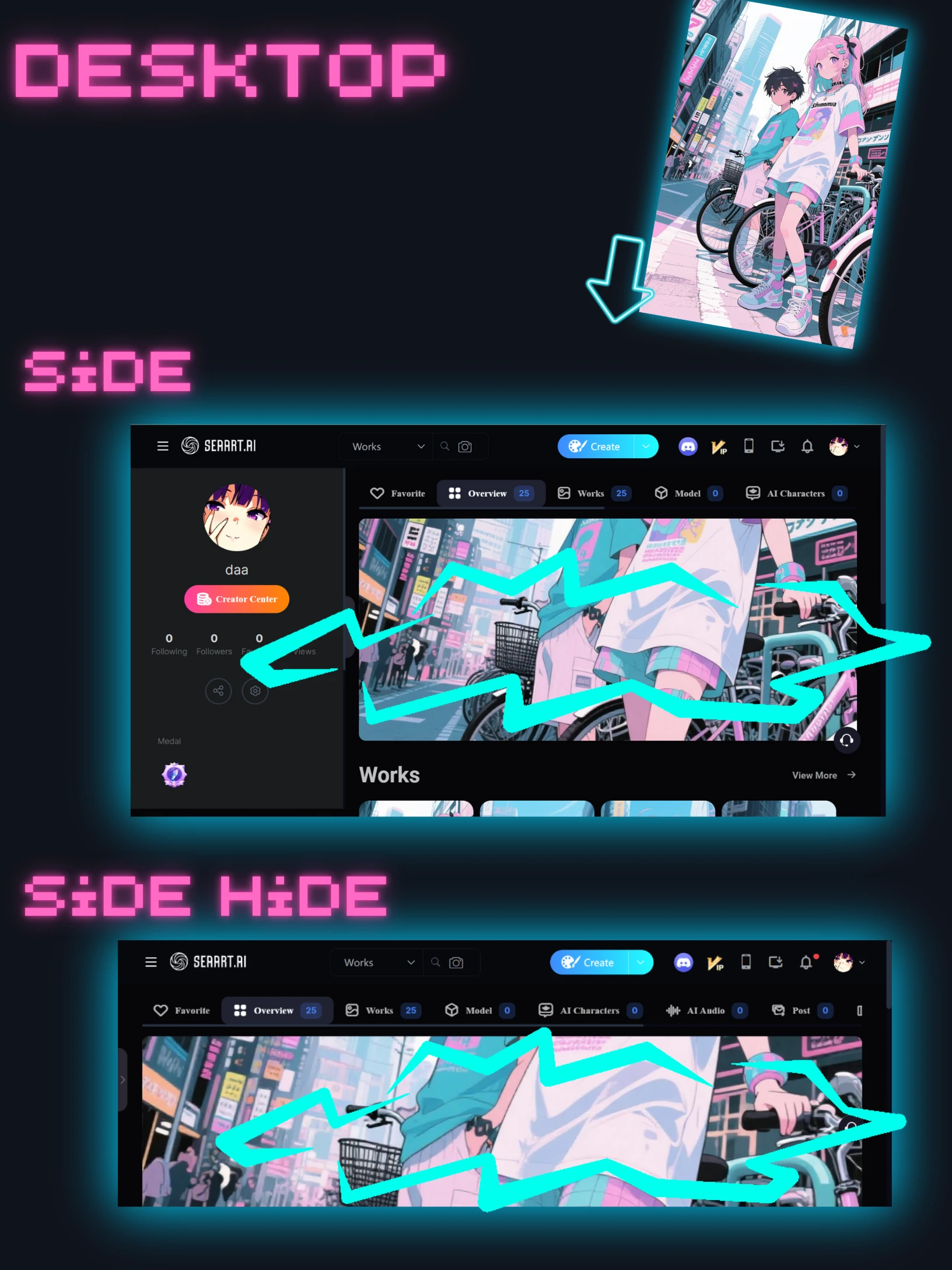
In the responsive version, the height is always 330px even if the browser width changes. For mobile, it is 215px.
The width expands to 100%.
The top and bottom are cut off.
.user-info-right-header>.bg[data-v-ef6f6238] {
background-position: 50%;
background-size: cover;
height: 330px;
width: 100%;
}
The header image will be positioned:
- Centered:
background-position: 50%;puts the image exactly in the middle. - Covering the whole area:
background-size: cover;makes the image big enough to fill the entire header space. Some parts might be cut off if the image's shape doesn't match the header. - Fixed height:
height: 330px;means it will always be 330 pixels tall. - Full width:
width: 100%;means it will stretch across the entire width of its container.
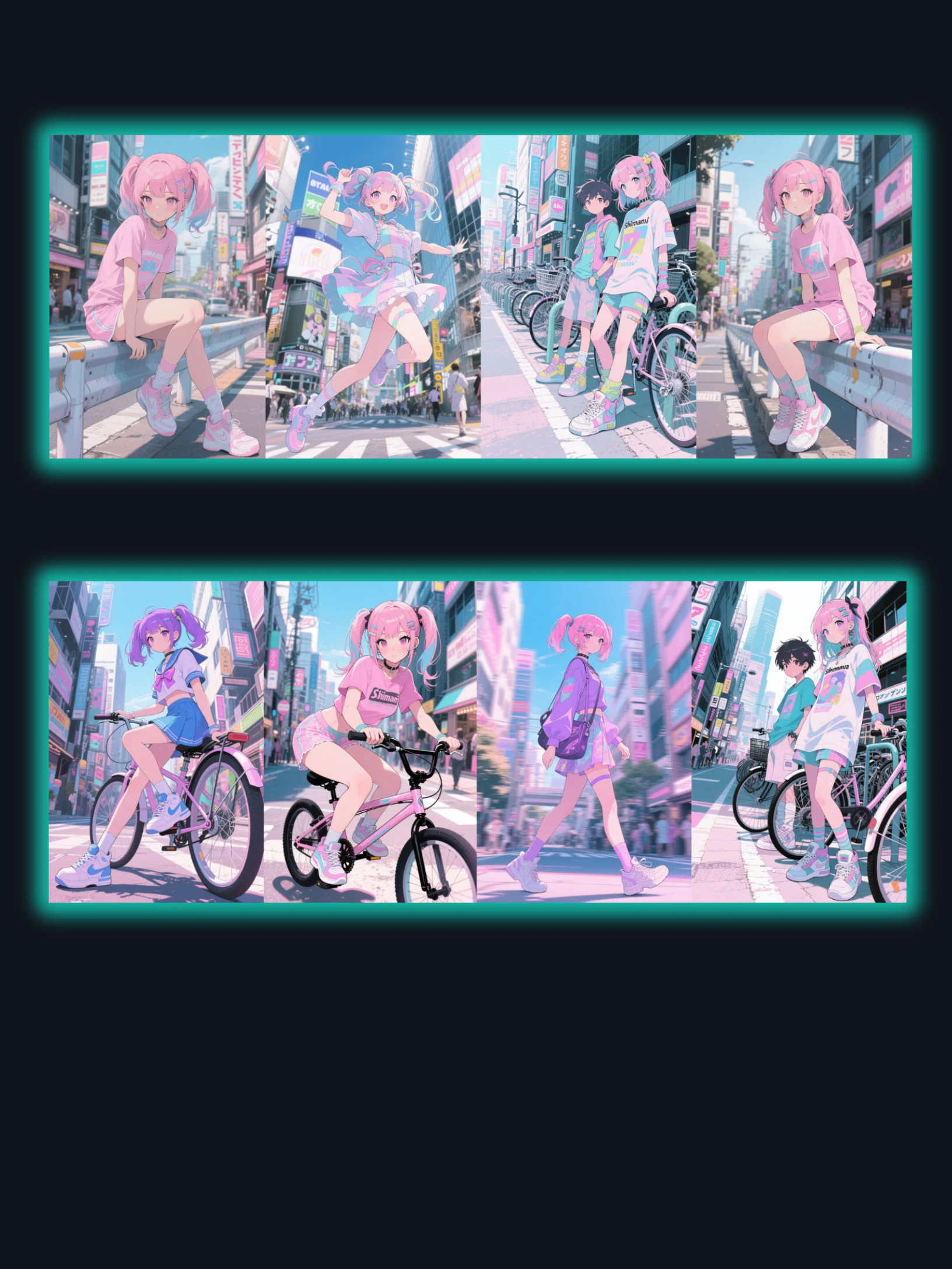
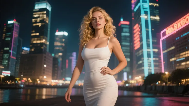
The model used.
It's fast. The limbs are also detailed. Any prompt will do.

model: https://www.seaart.ai/models/detail/26058e019e3a0c026e1ad2bfa69e2b75
With SeaArt Film you can easily make it like this.
How to set up a header image
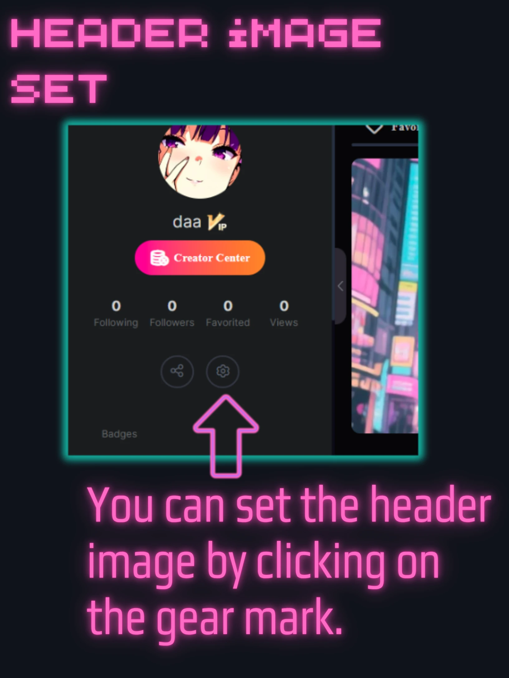
From here:https://www.seaart.ai/personal
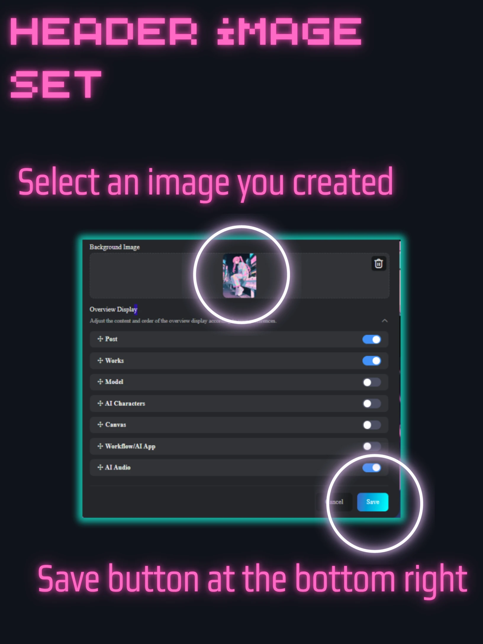
Set the image in the background using the gears and you're done.
There is a save button at the bottom, so press it
How to create a landscape image
If you use portrait, the top and bottom will not be visible. Use landscape ratio.
This only has 4:3 so use "more"
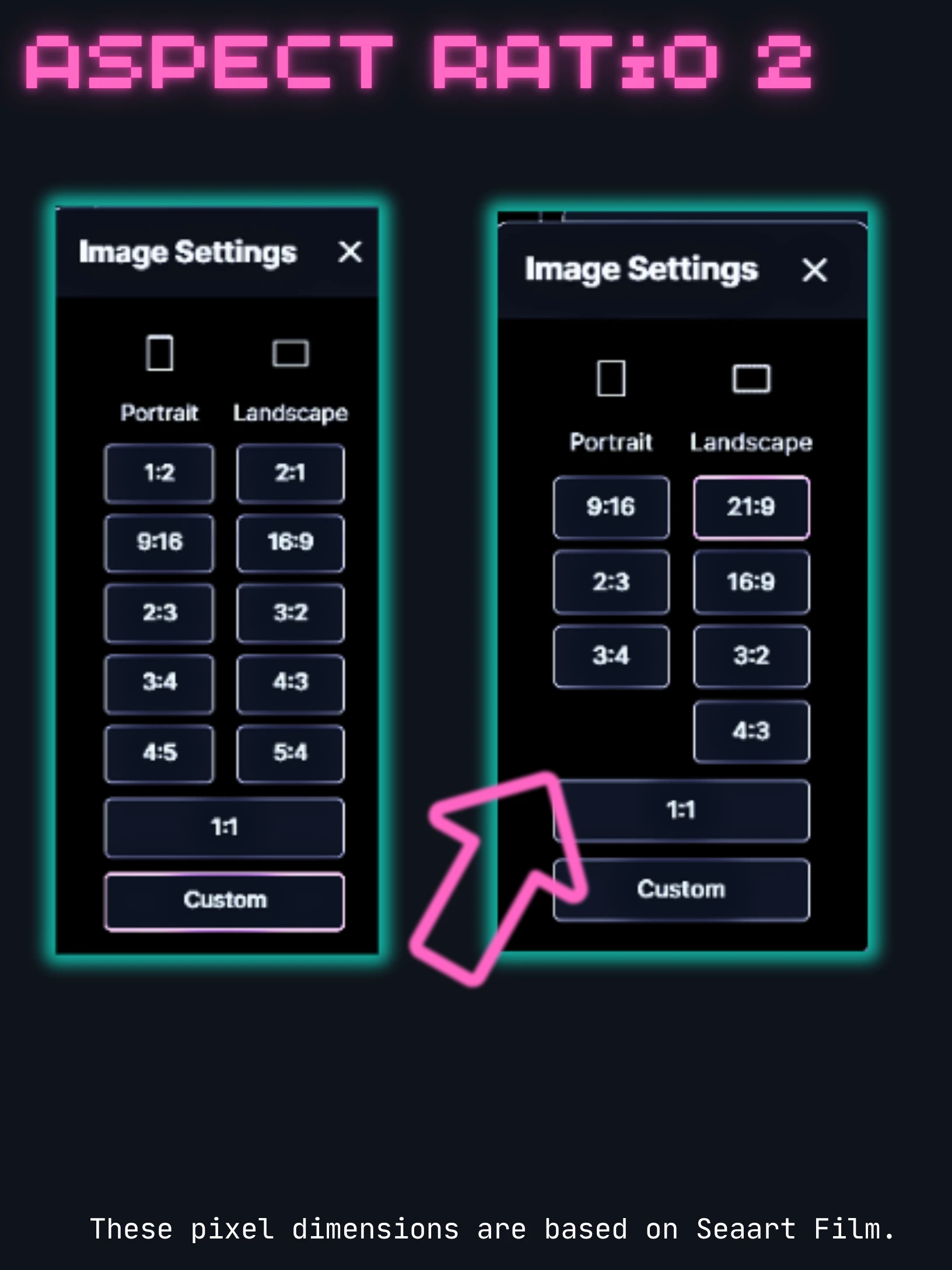
The values vary depending on the model. In this case, we are using SeaartFilm, so the explanation is on the right.
SeaArt looks very different on desktop and mobile, and the same goes for the app.
For responsive design, we looked into the header image size for each breakpoint.
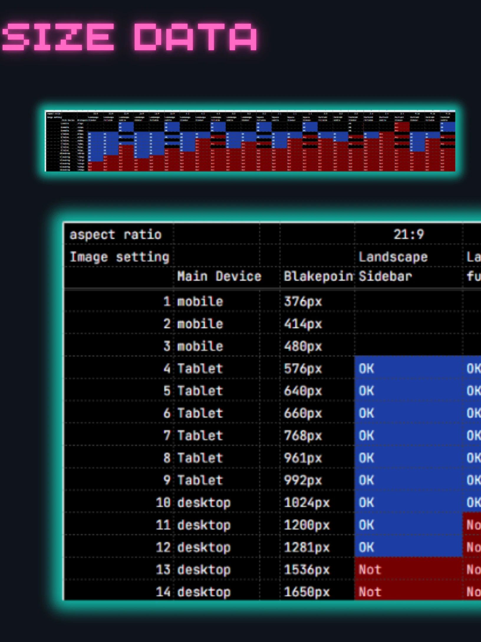
I have done a very detailed ***ysis, so I will post it separately.
Here's a link to an article comparing how different header image sizes actually look.
SeaArtFilm Generated Images: Aspect Ratio & Device Breakpoint Display Comparison


